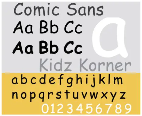
No typeface has ever invited so much of criticism as Comic Sans has done in the last decade. Designed by Vincent Connare in 1994, the font has annoyed folks to such an extent that there was a sort of the first ever campaign to ban a typeface. Then again, we have brands like Adidas, who have adopted it for several advertising campaigns and webpage designs.
Better known as Comic Sans MS, the casual, non-connecting script imitates the historical look of comic book lettering, for use in informal documents. However, its use for writing on serious subjects invited the wrath of two Indianapolis graphic designers, Dave and Holly Combs, who literally launched a campaign, dubbed Ban Comic Sans to oppose it. The main argument behind so much of condemnation is that the Comic Sans typeface fails to produce the intended effect, when it’s a serious message like a “do not enter” sign.
Comic book artist Dave Gibbons was more than dissatisfied with the font, who terms the imitation of his works as “a shame they couldn’t have used just the original font, because [Comic Sans] is a real mess. I think it’s a particularly ugly letter form.”
According to film producer and New York Times essayist Errol Morris, “The conscious awareness of Comic Sans promotes — at least among some people — contempt and summary dismissal.” Further, an online experiment revealed that Comic Sans, when compared with five other fonts (Baskerville, Helvetica, Georgia, Trebuchet MS, and Computer Modern), makes readers apprehensive about an otherwise true statement.